Beamleads

・Web App

UX redesign of lead extraction

and management dashboard

UX redesign of lead extraction

and management dashboard

Role:

Lead Designer

Duration:

4 Months

Team:

2 People

Introduction

Introduction

Introduction

Beamleads is a lead extraction and management platform designed to help businesses gather and organize leads from sources such as Facebook groups and embedded forms. It addresses the challenges businesses face in capturing leads across multiple channels and presents them in a structured, accessible format.

By automating the lead extraction process and centralizing data, Beamleads streamlines lead management, allowing users to focus on nurturing and converting prospects.

I was responsible for the platform’s UX and UI redesign, ensuring a seamless and user-friendly experience for users managing and tracking their leads.

Challenges

Challenges

Challenges

How might we enable users to effortlessly extract and manage leads from various sources, including Facebook groups and forms?


How might we display and organize lead data in a way that is visually intuitive and allows for quick insights and actions?


How might we reduce cognitive load for users by presenting lead data in a simplified and easily digestible manner?

How might we enable users to effortlessly extract and manage leads from various sources, including Facebook groups and forms?


How might we display and organize lead data in a way that is visually intuitive and allows for quick insights and actions?


How might we reduce cognitive load for users by presenting lead data in a simplified and easily digestible manner?

Overview

Overview

Overview

The redesigned lead management dashboard uses UX and psychological principles to improve usability, efficiency, and visual clarity. Key metrics are now prominently displayed, reducing cognitive load and helping users find essential data faster. Simplified navigation and a cleaner layout minimize decision fatigue, while increased contrast and white space enhance readability and reduce visual strain.

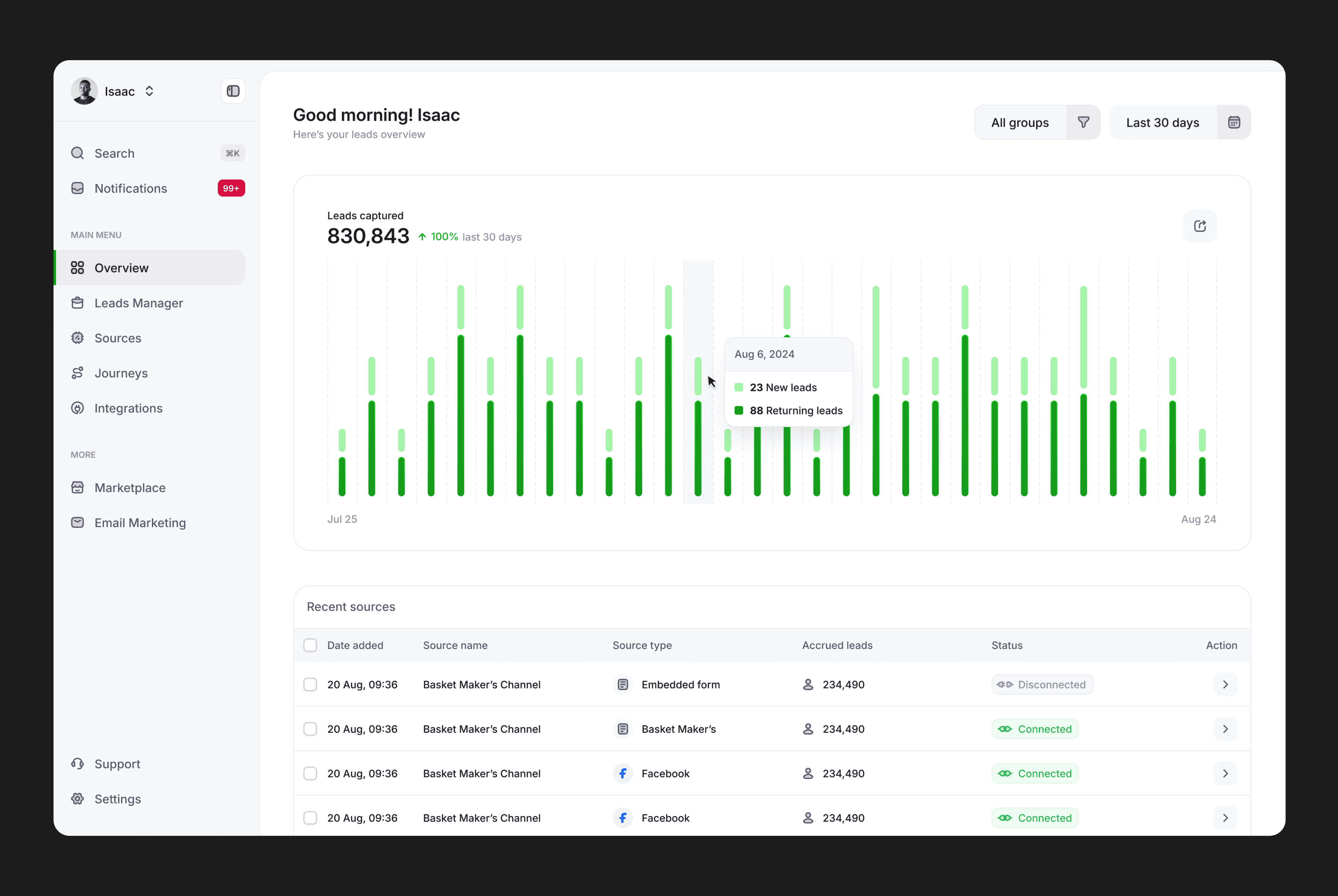
Data visualization improvements allow users to interpret trends at a glance, with tooltips offering further insights. Personalized greetings and recent source lists make the dashboard feel tailored to individual users, creating a familiar, comfortable interface that boosts productivity and confidence.

Data visualization improvements allow users to interpret trends at a glance, with tooltips offering further insights. Personalized greetings and recent source lists make the dashboard feel tailored to individual users, creating a familiar, comfortable interface that boosts productivity and confidence.

Side Menu

Side Menu

Side Menu

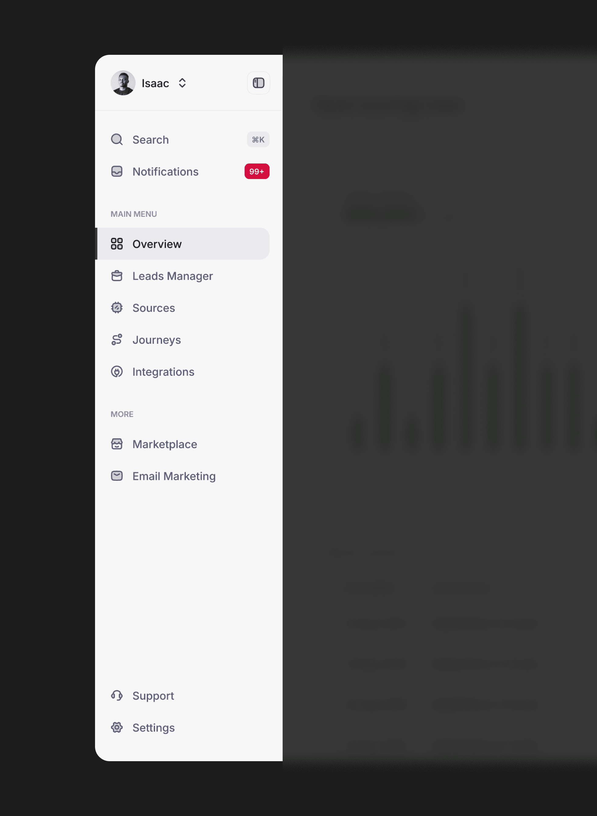
The redesign organizes menu items into logical sections, prioritizing frequently used features like “Overview” while grouping secondary actions (e.g., “Support”) separately. Enhanced spacing, contrast, and consistent iconography make the menu easier to scan and more inclusive.

The redesign organizes menu items into logical sections, prioritizing frequently used features like “Overview” while grouping secondary actions (e.g., “Support”) separately. Enhanced spacing, contrast, and consistent iconography make the menu easier to scan and more inclusive.

The new design introduces a user avatar, “Search,” and “Notifications,” placing essential tools prominently in one place.

The new design introduces a user avatar, “Search,” and “Notifications,” placing essential tools prominently in one place.

Leads Manager (Before)

Leads Manager (Before)

Leads Manager (Before)

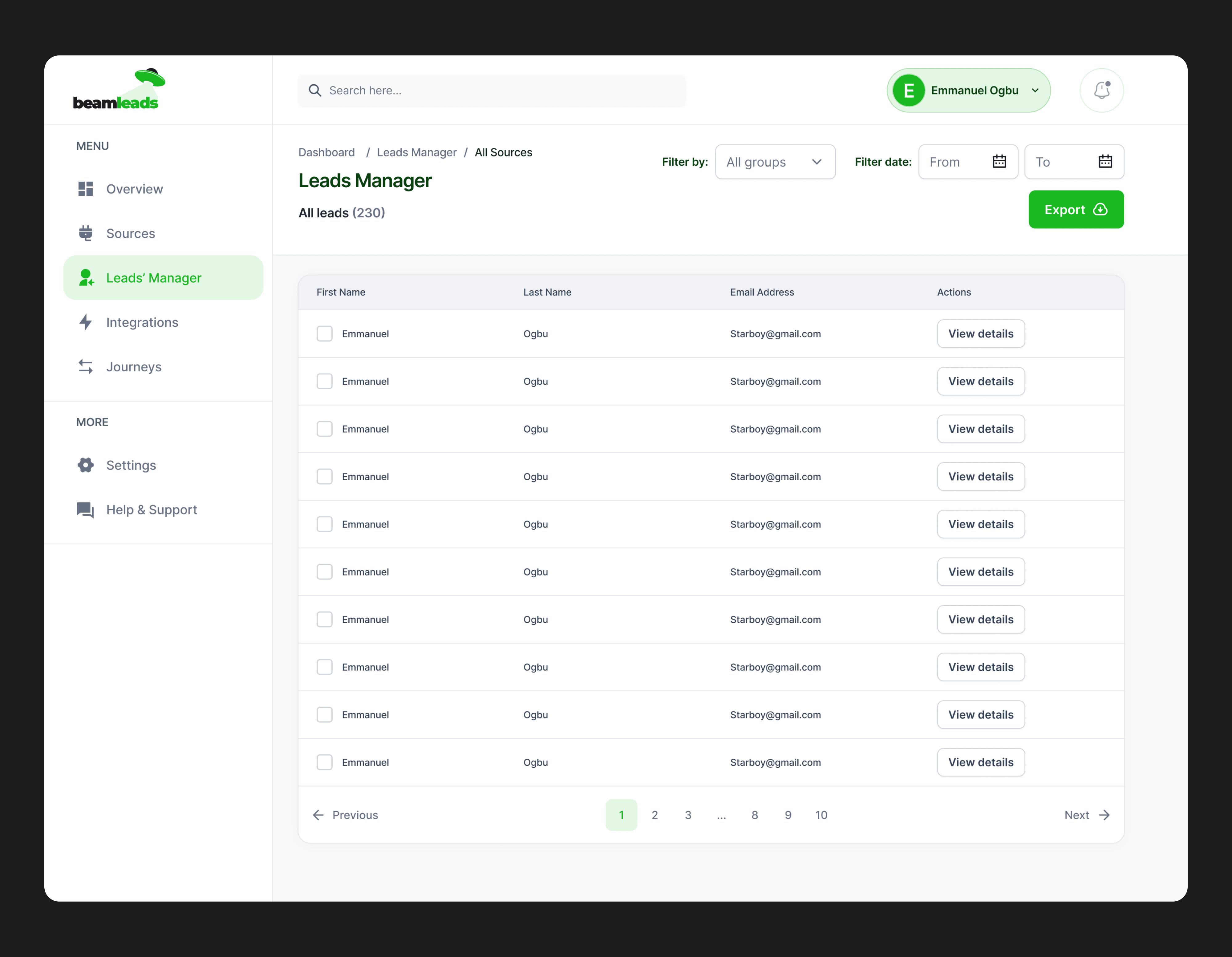
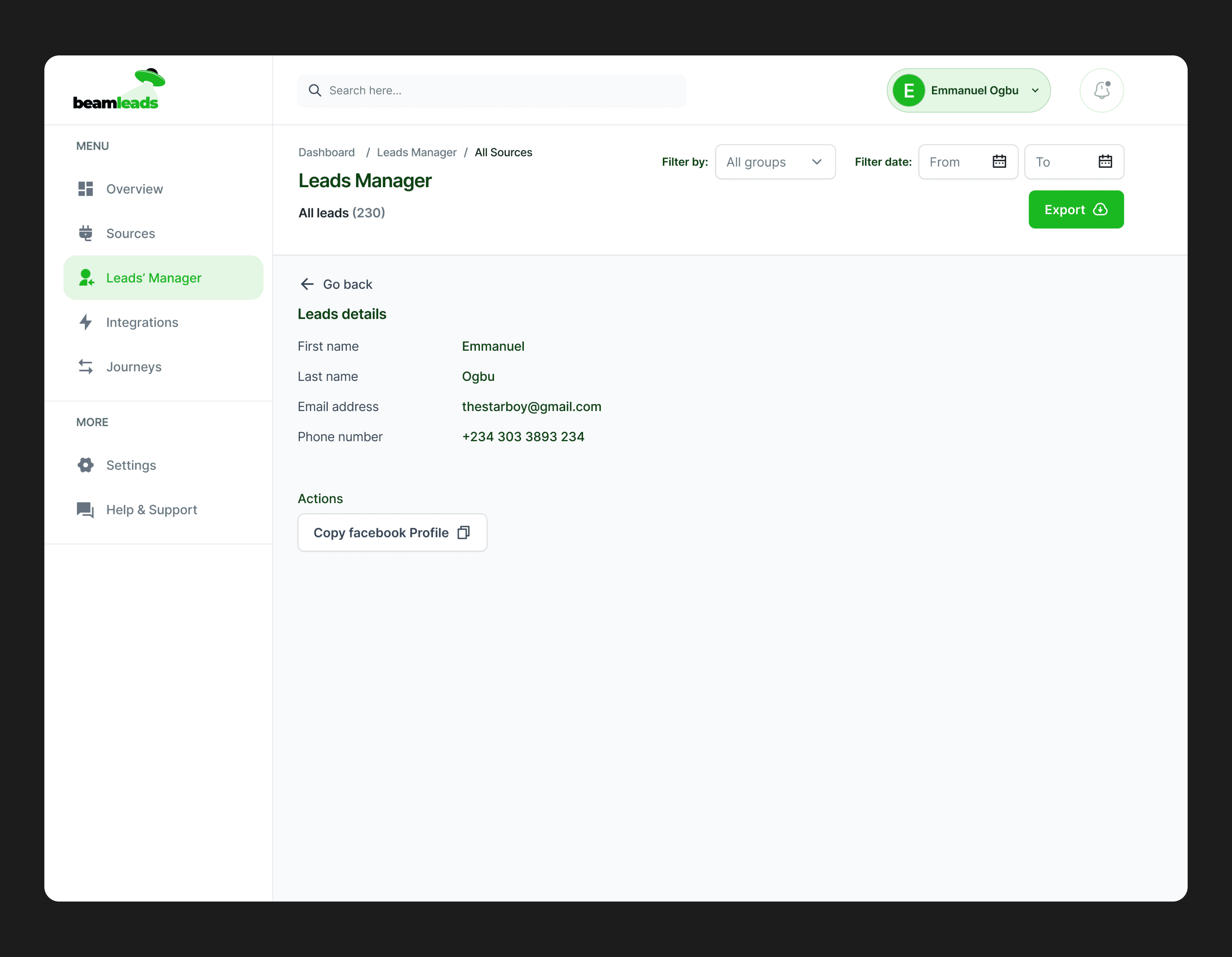
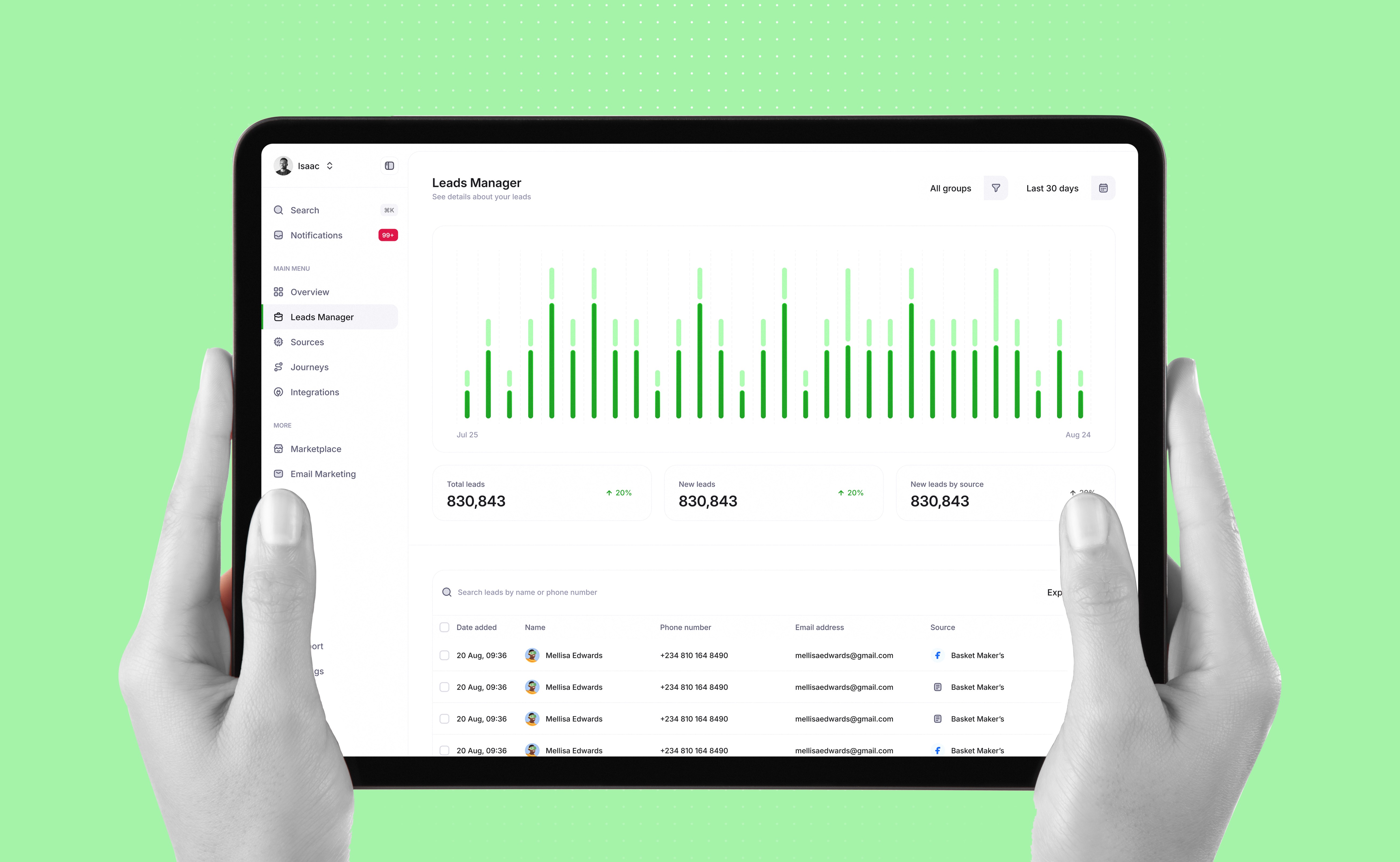
The Leads Manager tool is central to Beamleads, enabling users to view, manage, and act on leads. The initial design lacked clarity, actionable insights, and user-centric functionality, creating friction in the lead management process. The redesign addresses these issues by prioritizing usability, visual hierarchy, and intuitive interaction patterns, ensuring users can access data efficiently and take meaningful actions with ease.

The Leads Manager tool is central to Beamleads, enabling users to view, manage, and act on leads. The initial design lacked clarity, actionable insights, and user-centric functionality, creating friction in the lead management process. The redesign addresses these issues by prioritizing usability, visual hierarchy, and intuitive interaction patterns, ensuring users can access data efficiently and take meaningful actions with ease.

Leads Manager (After)

Leads Manager (After)

Leads Manager (After)

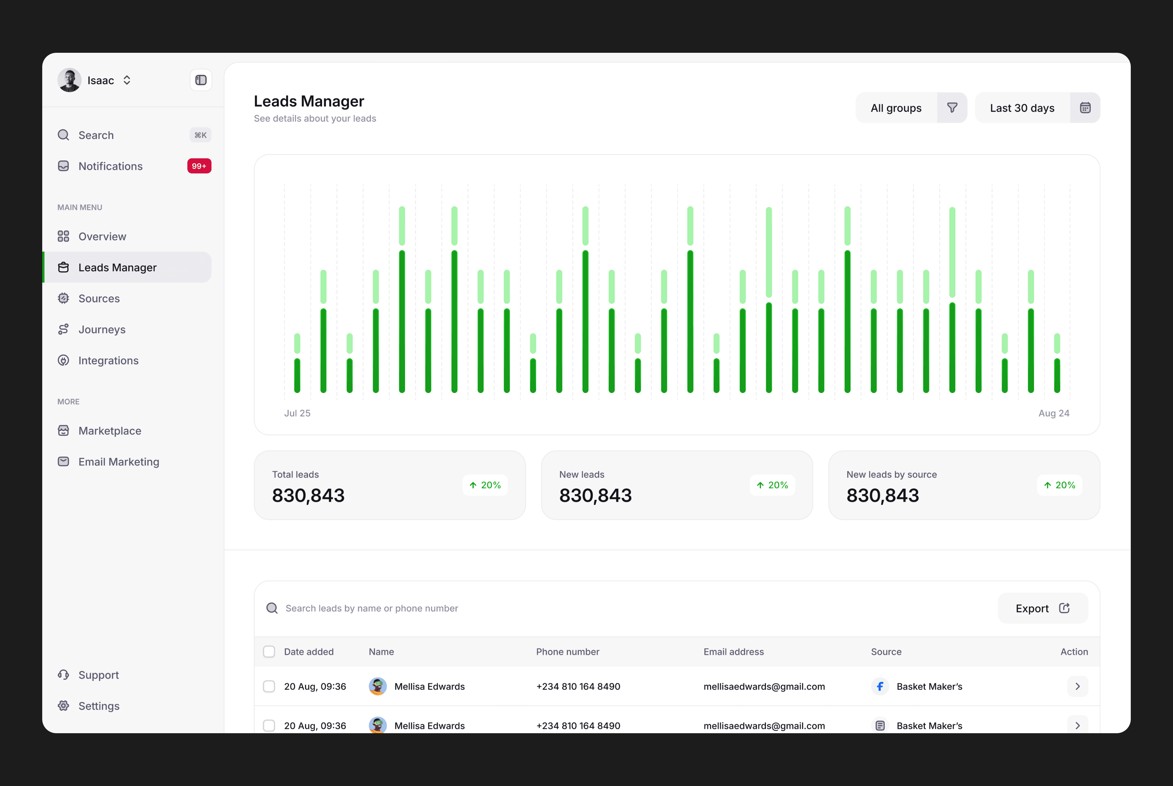
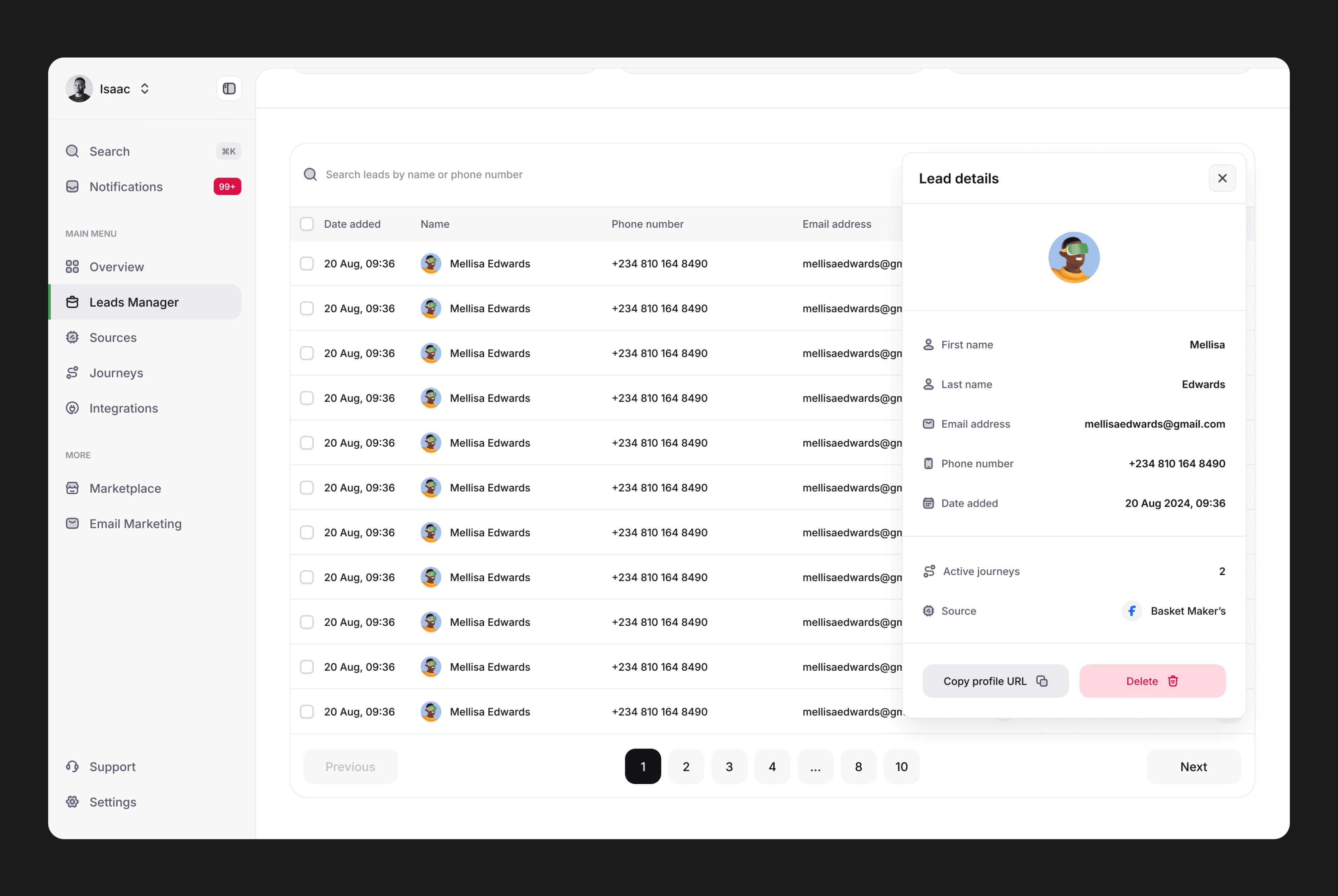
The redesigned interface introduces a dashboard view with data visualizations, such as bar graphs, summarizing key metrics like “Total Leads Captured” and “Returning Leads.”.

The redesigned interface introduces a dashboard view with data visualizations, such as bar graphs, summarizing key metrics like “Total Leads Captured” and “Returning Leads.”.

Viewing individual lead details required multiple clicks, disrupting the user workflow and increasing task time. The updated design incorporates an inline lead detail panel, allowing users to view and edit lead information without navigating away from the main screen.

Viewing individual lead details required multiple clicks, disrupting the user workflow and increasing task time. The updated design incorporates an inline lead detail panel, allowing users to view and edit lead information without navigating away from the main screen.

The redesign employs a clean layout with distinct sections, improved spacing, and typography to guide user attention. Critical actions like exporting or filtering leads are prominently displayed, reducing friction.

The redesign employs a clean layout with distinct sections, improved spacing, and typography to guide user attention. Critical actions like exporting or filtering leads are prominently displayed, reducing friction.

Sources (Before)

Sources (Before)

Sources (Before)

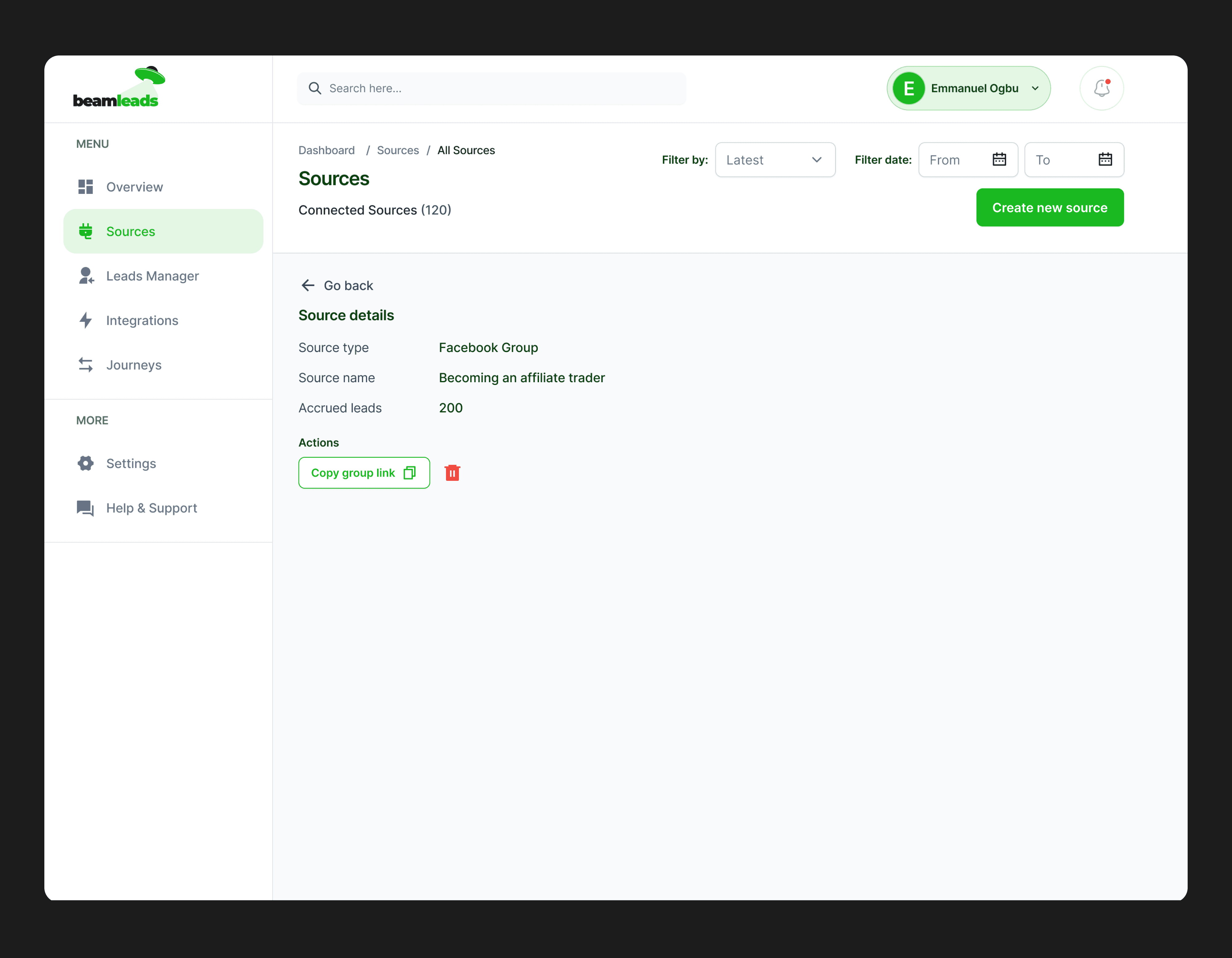
The Sources Dashboard in Beamleads allows users to view and manage lead sources, such as Facebook groups and embedded forms. While the original design provided basic functionality, it lacked clarity, insights, and streamlined workflows. The redesign focuses on improving usability and data visualization.

The Sources Dashboard in Beamleads allows users to view and manage lead sources, such as Facebook groups and embedded forms. While the original design provided basic functionality, it lacked clarity, insights, and streamlined workflows. The redesign focuses on improving usability and data visualization.

Sources (After)

Sources (After)

Sources (After)

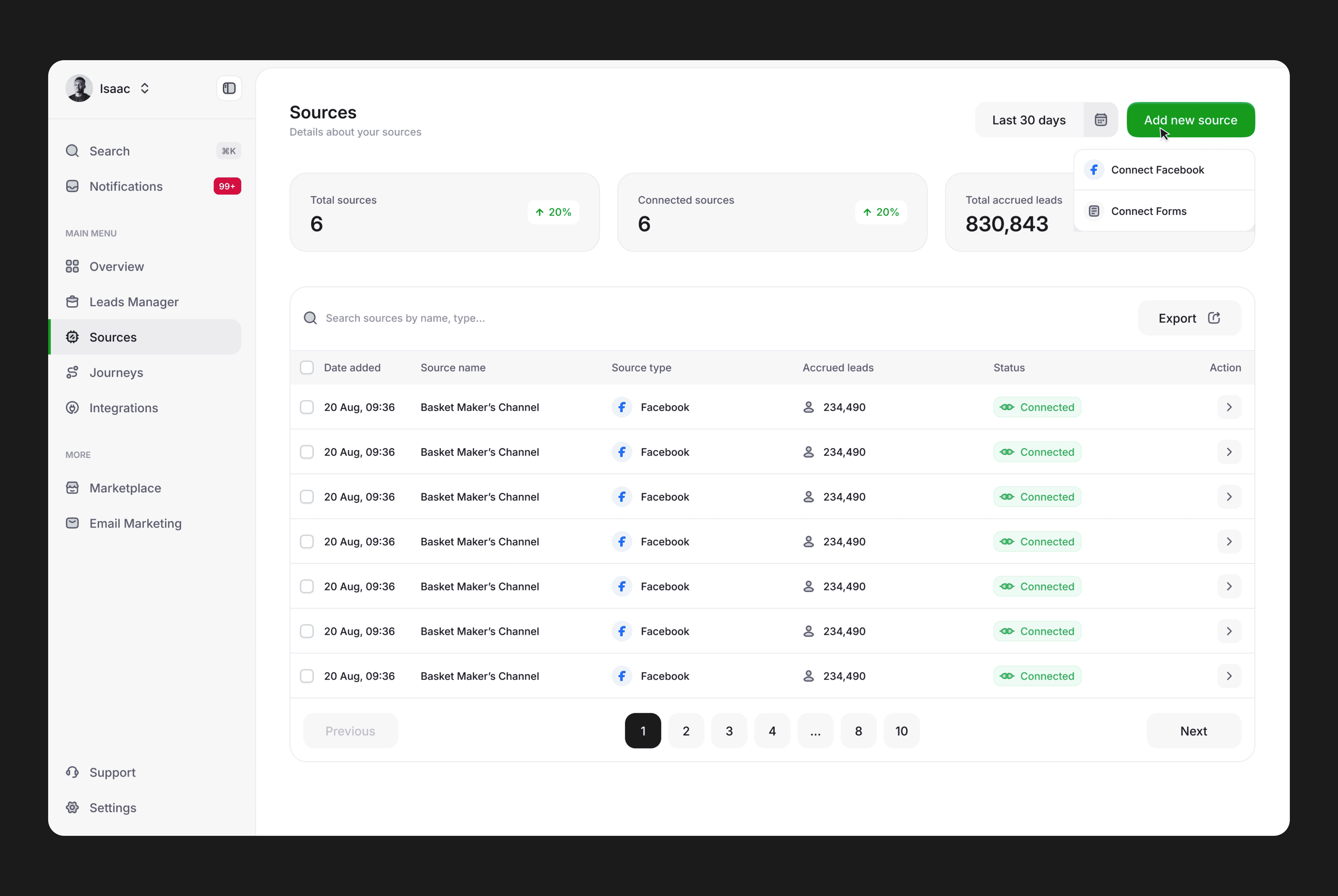
Users could only view a static table of sources, without a summary of overall performance or trends. Key metrics such as “New Sources,” “Active Sources,” and “Total Leads” are prominently displayed at the top, providing an at-a-glance overview.

Users could only view a static table of sources, without a summary of overall performance or trends. Key metrics such as “New Sources,” “Active Sources,” and “Total Leads” are prominently displayed at the top, providing an at-a-glance overview.

The table is enhanced with better spacing, distinct status indicators (e.g., “Connected”), and improved typography. Sorting and filtering options are now more prominent, enabling users to find specific data quickly.

The table is enhanced with better spacing, distinct status indicators (e.g., “Connected”), and improved typography. Sorting and filtering options are now more prominent, enabling users to find specific data quickly.

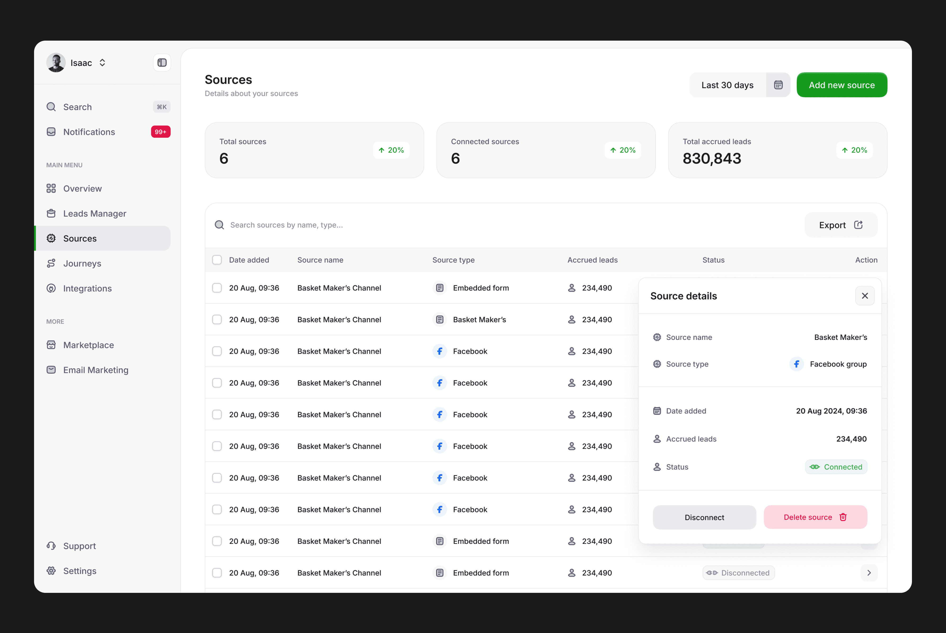
Also, an inline detail panel allows users to view and edit source information without navigating away.

Also, an inline detail panel allows users to view and edit source information without navigating away.

Sources - create new form (Before)

Sources - create new form (Before)

Sources - create new form (Before)

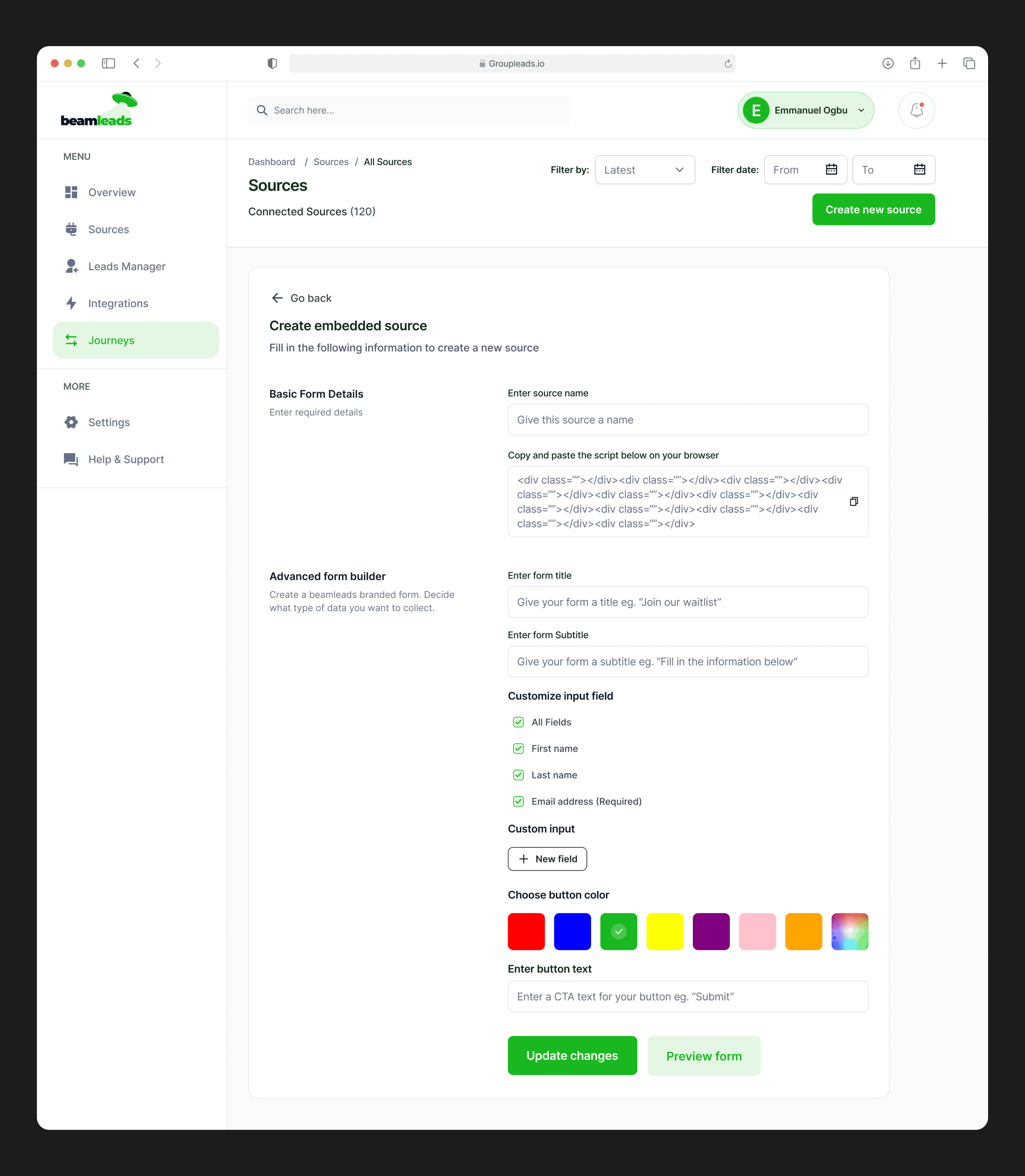
The original design features a single-column layout that limits the visual and functional hierarchy.

Essential form-building options (e.g., field customization, color themes) are not immediately visible, requiring additional exploration.

There is no real-time preview of how the form will appear to the end user, users may need to navigate back and forth to check their form’s design.

The workflow requires users to toggle between pages or sections, leading to increased cognitive load and task time.
Sources - create new form (After)

Sources - create new form (After)

Sources - create new form (After)

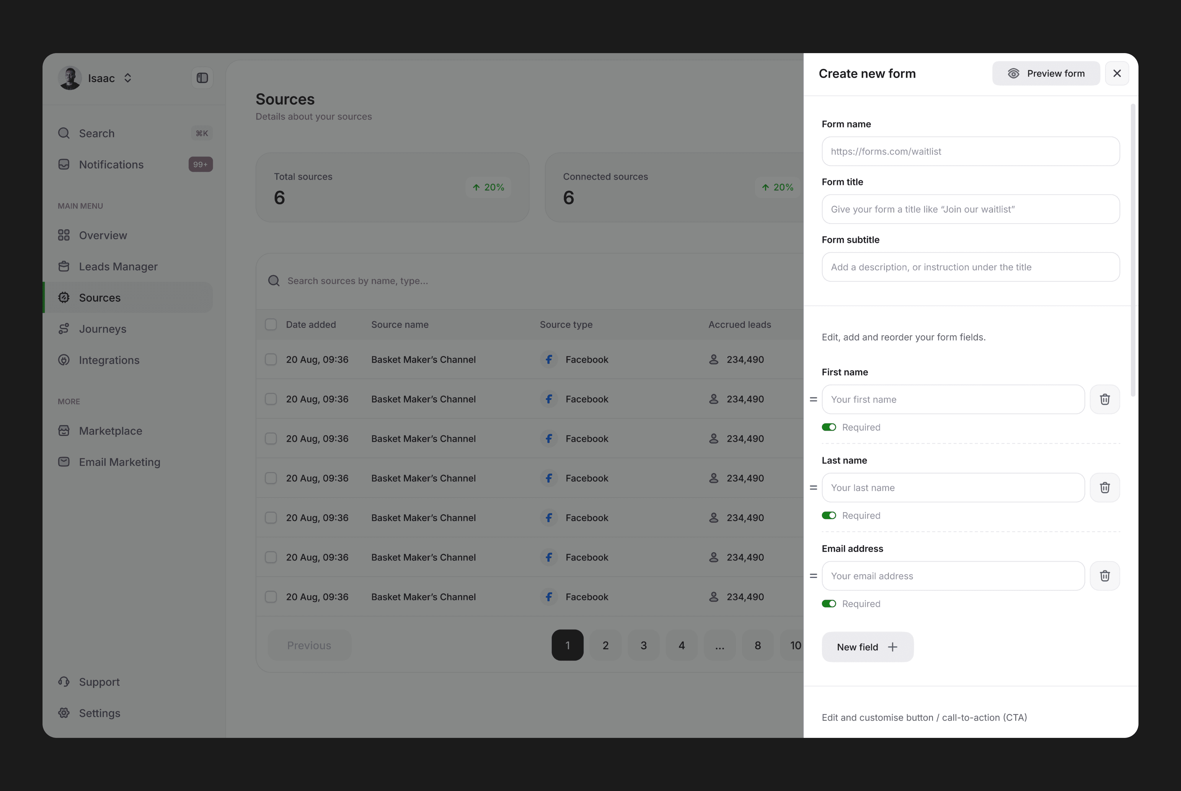
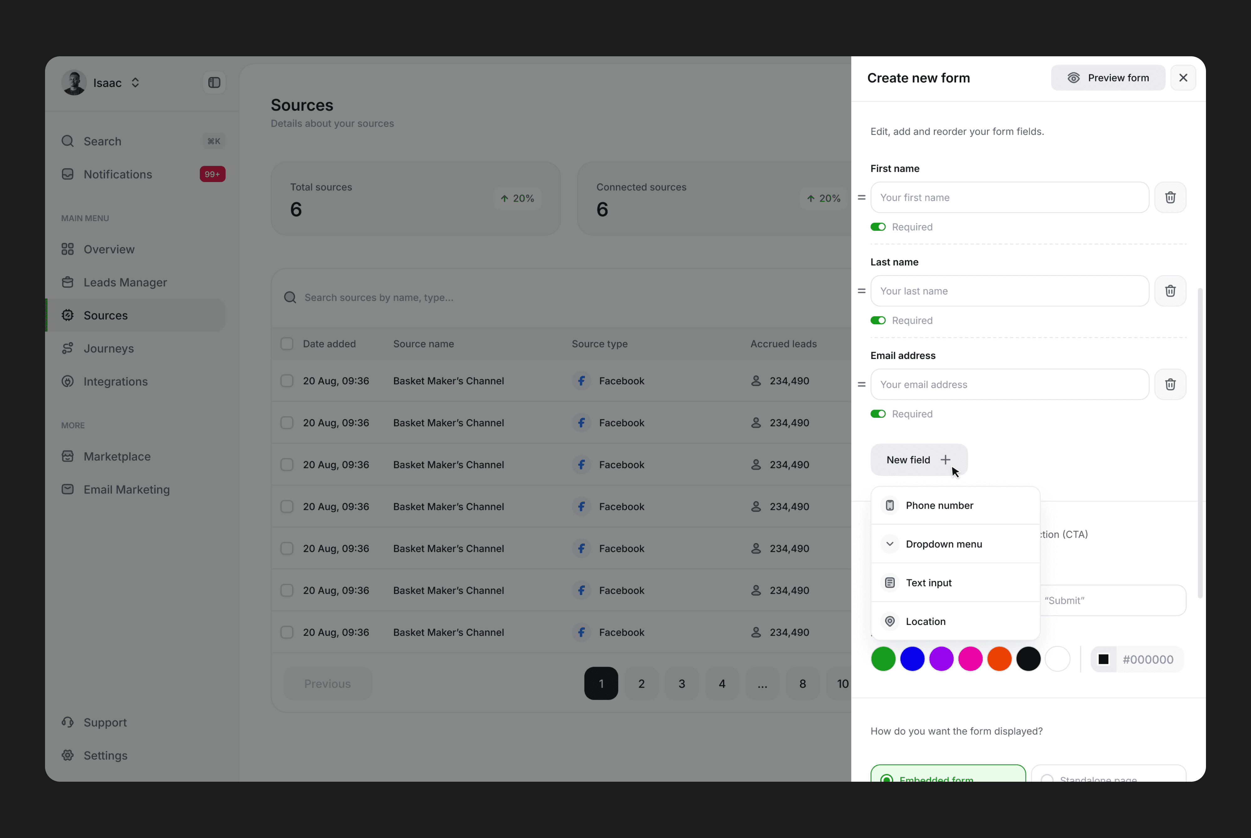
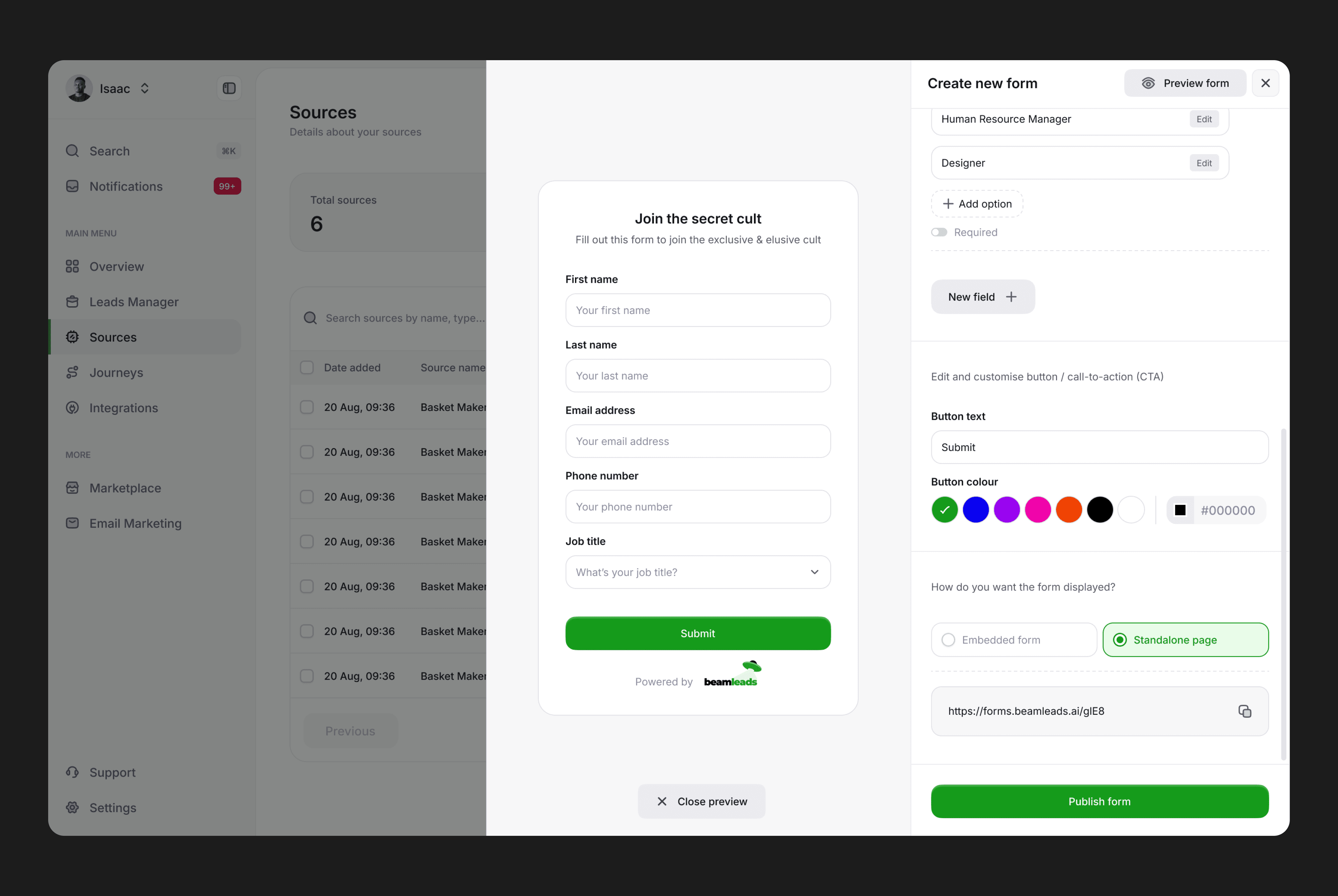
The redesign adopts a multi-panel structure that segments key features logically. Users can manage form details, customize fields, and select color themes without switching pages, reducing task friction.

Descriptive labels and tooltips are added for advanced settings, such as embedding options or conditional logic. Clear placeholders in the form fields (e.g., “Enter your email”) guide users in understanding the end-user perspective.

A preview panel is integrated directly into the interface, allowing users to see changes as they make them. This reduces guesswork and builds user confidence in the final output.
Integrations (Before)

Integrations (Before)

Integrations (Before)

The layout displayed integrations as independent cards, each occupying significant screen space. Titles, descriptions, and statuses competed for attention, creating cognitive overload. The lack of alignment and inconsistent spacing made it difficult to scan the page efficiently.

A preview panel is integrated directly into the interface, allowing users to see changes as they make them. This reduces guesswork and builds user confidence in the final output.
Integrations (After)

Integrations (After)

Integrations (After)

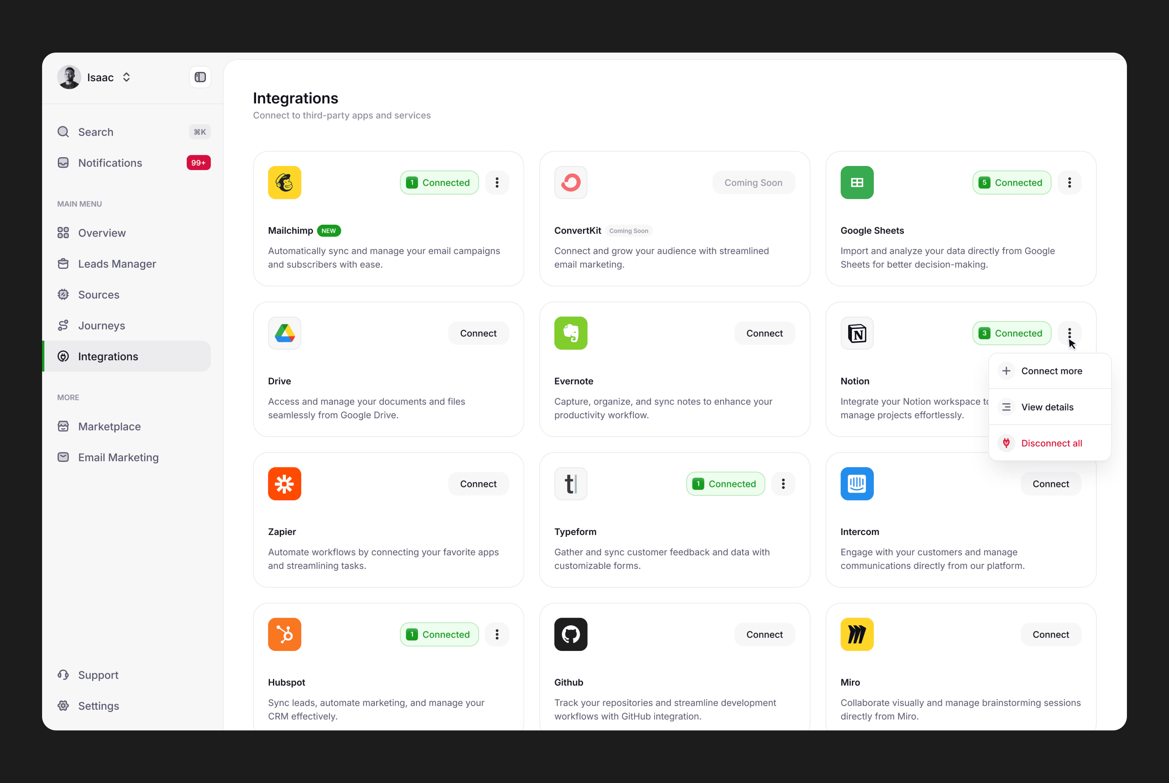
The improved design uses a structured grid layout with clear alignment, compacting content while maintaining clarity. Improved scannability allows users to locate specific integrations faster, reducing frustration and time spent navigating.

Key actions are now visible directly in the grid, such as “Connect,” “Disconnect,” and dropdown options for more functions. A subtle hover state on each card enhances discoverability without overwhelming the interface.
Conclusion

Conclusion

Conclusion

The Beamleads redesign aimed to transform a functional but outdated lead management platform into an intuitive, efficient, and visually engaging tool tailored to small business owners. Across key areas such as the Leads Manager, Sources Dashboard, and Side Navigation, the redesign introduced actionable insights, improved workflows, and modernized aesthetics. Features like inline detail views, streamlined navigation, and contextual metrics empower users to access critical information quickly and act on it seamlessly.